

How does the color of packaging influence us? We are mostly driven by visual perceptions in our decision making. We think about things and remember them through associations and color plays a crucial role in it. Even though colorimetry isn’t a rocket science choosing a proper color for a product can be a real challenge. It’s quite understandable, as there are dozens of parameters to consider when choosing a color – from the type and form of packaging to font style and product shelf placement. So, what to consider when choosing packaging colors?
Bright or pale colors?
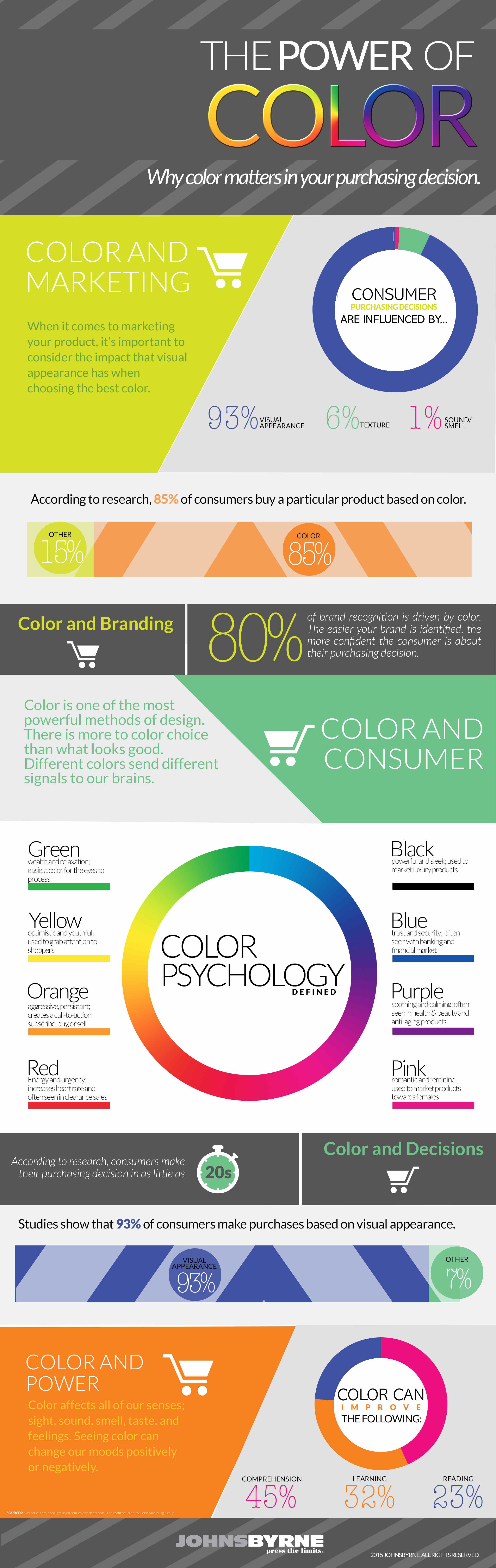
There are multiple articles online explaining what different colors mean and which emotions they provoke. Such publications will tell you that yellow color provokes excitement and positivity, green is associated with nature, white means purity, red is the ultimate attention grabber, while black represents exclusiveness and luxury. However, very few of them explain the significance of shades, which are sometimes even more important than the colors themselves.
The thing is that as human beings we associate less intense colors with less intense taste and flavors – not a good idea when trying to sell beverages or food. At the same time, darker shades provoke associations with health and intense taste. This can be easily proved by the following case studies.
Coca-Cola Light vs Coca-Cola Zero Sugar
For instance, the light-colored packaging is associated with health and usefulness of the product but at the same time lowers taste expectations. Coca-Cola Light is a vivid example of this pattern. Since the product’s introduction in the early 2000s, its sales dwindled by around 10% per year. The main reason – improper choice of the packaging color scheme. After the product was rebranded as Coca-Cola Zero Sugar the sales spiked. It was practically the same product but in the different package and the result was stunning. One of the key reasons behind this change is a totally different approach to color choice. Light and pale silver colors were replaced by the appealing and aggressive black and red color range. What is even more interesting is that not only did the sales improve, but the taste perception as well.

Lindt and Godiva
Though, Coca-Cola’s example isn’t unique. Just consider the recent case of truffle branding done by two chocolate industry giants Lindt and Godiva, and you’ll see that the packaging color can be a real game changer. In the aforementioned case, Lindt used predominantly red color scheme of packaging with white text accents. It proved to be 3 times more attractive than calmer and traditional cream color styled Godiva pack. Why? Because the red color in packaging design is known as the ultimate attention grabber. It also increases heart rate and excitement in such way provoking the additional interest of consumers.

Additionally, not only the color makes the show. The reasons behind this are quite simple: Lindt package features fewer elements and thus sends a clearer message to consumers. Furthermore, the text on the package is more readable – just by quickly looking at the pack you can understand that it’s milk chocolate truffles. Furthermore, thanks to the small transparent “window” you can see that each candy is separately wrapped in glossy red paper which resonates with the color of the pack. The name of the trademark is also clearly visible. In such way, the Lindt packaging is far more informative compared to that of Godiva.
Nevertheless, color shades are not the only things to consider when choosing packaging colors. The design of the package itself can play a major role in how the colors on it will be perceived. Packaging design is really something to be taken seriously and if done properly, it can have an astonishing impact on the sales of your product.
Learn more about how to make sure that your packaging design appeals to customers.
